Workarea Redesign
Overview
Workarea is an open-source, enterprise-grade commerce platform. Workarea customers include the Bouqs, Sanrio, BHLDN, Reformation, Woodcraft, and Lonely Planet.
Challenge
The goal of this project was to redesign the Workarea website to better match our new brand guidelines and marketing messaging while improving the overall user experience.
The new site needed to help facilitate the customer journey from initial awareness toward the purchase of our product — the Workarea Commerce Platform.
The website was being migrated from an outdated, limited WordPress template, to the Workarea platform.
My role
As an Experience Designer, I worked closely with members of the product team, marketing team, and sales team to design and curate the content for the site. I took a mobile-first design approach while considering all viewports including tablet and desktop. The new design featured new brand fonts, colors, iconography, and photography styles.
In addition to designing the site, I assumed the role of product owner for this site build. I maintained the backlog, influenced delivery teams, and tracked KPIs.
I led the implementation of google analytics, managed event tracking, and oversaw the application of google search console to ensure site performance was not impacted.
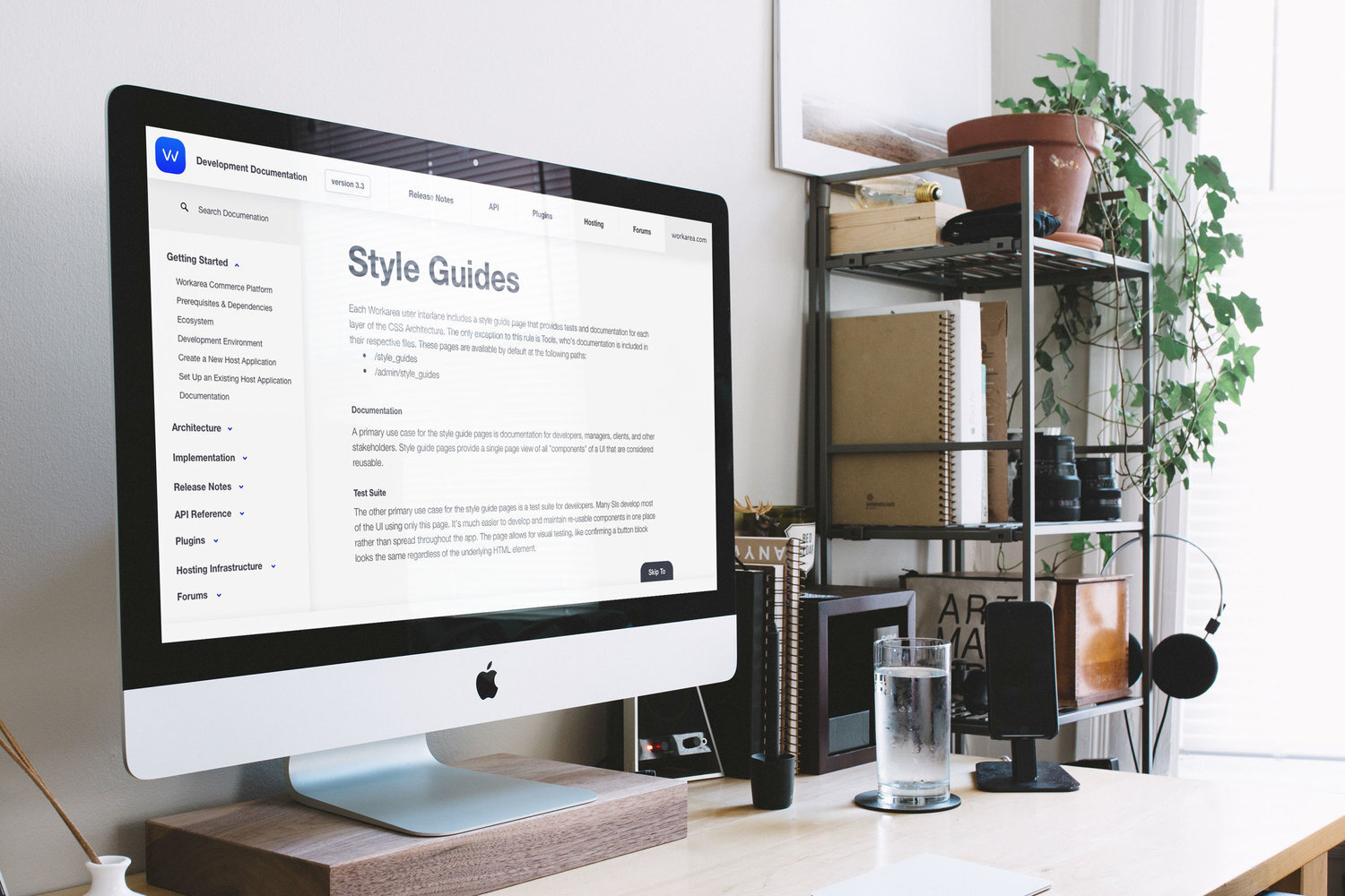
A mockup of the design system I created for the Workarea website.
Solution
Easy-to-use navigation
After conducting stakeholder interviews, reviewing analytics, and compiling competitive research, I developed the information architecture and site navigation.
The primary navigation included high-level categories for the platform, customers, partners, developers, and company. This navigation disappeared as a user scrolled down the page to give more room to read informative content, and was revealed as a user scrolled up.
The primary navigation, with the get started call to action.
The platform was the most important category within the main navigation. This category was where I added a secondary navigation bar. This bar was sticky as the user scrolled the page, allowing them to dive into core pillars of the overall product offering: Commerce, Content, Search, Insights, Admin, and Tech.
The secondary sticky navigation that allows users to browse key product pillars.
Getting started
The process of selecting an e-commerce platform can take weeks to months. It involves in-depth consultations with solutions engineers to identify a customer’s specific needs. That is why it is important to help industry professionals quickly get in contact with a sales representative.
I included a clear call to action to “get started” in the main navigation bar to propel user’s toward converting by guiding them further toward the purchase of our product, by speaking with a sales representative.
Customer stories
A key element of this site focused on customer stories that offered proof of successful implementations on the Workarea Commerce Platform. These customer stories showcased images, stats, and details about how Workarea empowered business users to reimagine the shopping experience online, in-store, and across brands.
I curated the content for these customer stories by creating imagery, interviewing customers, and highlighting the strengths of each website. The customer-focused case studies included a callout that highlighted a client’s favorite feature on the platform, their industry, and other key facts prospective customers may be interested in.
As a secondary focus of this site, I designed an easy to navigate content library of resources for developers building on the Workarea platform.
Workarea developer documentation site
Results
Since launching the new workarea.com:
Total users increased 32.61%
New users increased 35.20%
Sessions increased 30.79%
Pageviews increased 145.75%
Avg. Session duration 32.03%
Bounce rate decreased 60.72%
This data was taken over a six month period following our launch compared with the previous year.


